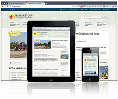
The internet and communication technologies have grown to many new areas like mobile computing, smart phones, tablet pcs and more. These rapid developments within a few years have demanded greater responsibilities to the web designers to accommodate websites and blogs in many of the multiple devices available today. This technical competence to prepare websites for universal access is called responsive web designing. In the responsive designing lay out the images appear to change fluidly with the help of special developer tools and coding languages.
The Key Elements of Responsive Web Designing:
 The first and most important step in responsive web designing is to create a flexible lay out by allowing the fluid grids to resize the content according the screen resolution. The flexible lay out is dependent on the screen resolution where texts and contents get filled automatically without the user adjustments.
Within a flexible lay out the images get changed on the fly so they also need to be resized to adjust to different resolutions. This is achieved by cropping or resizing the images when it gets below a specified size.
In traditional web designing, as part of the CSS3 specification, media queries control how the styles are applied. In responsive web designing, it allows the web designers to meet the styles based on device properties like screen width, orientation and other similar aspects.
Responsive web designing is thus different from usual web designing in terms of technical competence on the part of the designer. It is still in its beginning stage and lots of tools and techniques are expected to emerge in the future as the technology progress upwards.


Good post, thank you. What is the best way of resizing images when scaling down?
Thanks!